Oregon State
Project Overview
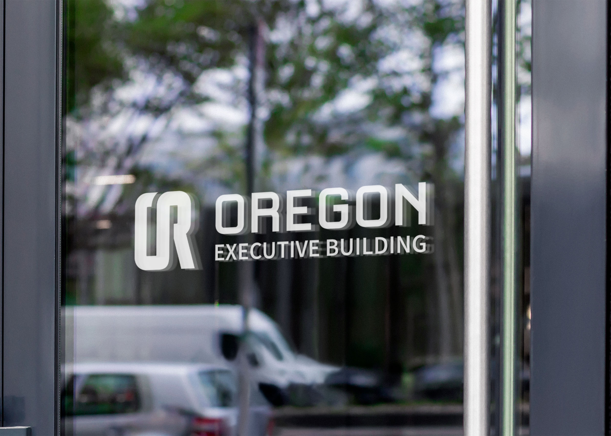
The State of Oregon was in need of a distictive mark that could represent the state as a whole. I decided to use the state’s postal abbreviation as a focal point. The letter-mark is adventurous, modern, and bold. The rounded edges are inspired by the many coasts and rivers it has. The final letter-mark is a business forward mark that gives the state a well polished look.
Project Type
Visual Identity
Year
2025
My Role
Designer
Client
The State of Oregon


